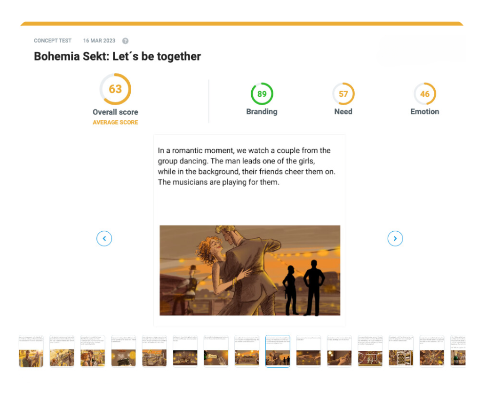
Storyboard
1. What does this format look like?
A storyboard is affordable and easy to prepare. It is also much easier for audiences to understand than an animatic, which can sometimes confuse the viewers into thinking they are watching the final product. Storyboard, on the other hand, is straightforward and simple to produce – you can even use AI generators (especially useful for smaller brands).
Example:
Author: Tomas Zach (3ax.cz)
2. What do the results look like?

3. How to prepare for testing?
We need a couple of things from you before we can test the effectiveness of your creative.
- Provide the correct format
- Define your product category
- Come up with the messages (brand associations) you want to test
- List your competitors
- Define your target audience
3.1. Correct format
ESSENTIALS
- Insert the concepts you wish to test into the template.
- Use a maximum of 15 images.
- Ensure images are large enough for easy recognition, even on mobile devices.
- Add text without resizing or moving the text boxes for readability.
- Keep the storyboard as close to the final ad as possible for accurate results.
- Don't forget to include your brand (e.g., if your campaign opens with your logo, use it as the first image).
TIPS
💡 Be concise—don’t explain what people should think or feel.
💡 Avoid foreign words or technical terms that might not be understood by everyone.
💡 Clearly separate the voiceover with quotation marks.
💡 Don’t highlight brand codes (logos, mascots, jingles) or things respondents may not recognize.
3.2. Product category
3.3. Messages
3.4. Competitors
3.5. Target audience
✅ Everything ready! What now?
Upload everything into the platform or drop us an e-mail with the contents you've prepared.
We'll make sure nothing is missing and start gathering data immediately! If we need further clarification on something, we'll let you know!

