Benchmarks – knowing if I’m better or worse than someone else – are much more exciting than the original numbers behind them.
It sounds alright when 50 % of the sample react with positive emotion to your creative. But what if that’s a “usual” score for ads in general? Or what if most ads arouse much better emotion? Is 50 % good enough? That’s why the metrics in our reports always have additional information to them - how well each result matches up against other campaigns (benchmarks).
We show:
how good your result is compared to this benchmark (green, yellow or red color) and
what the average for the metric is.
What do the colors mean?
To give you a clear sense of whether your score is high, average, or low, we use three colors with the following thresholds:
Result is green,if it scored in the top third of all campaigns in this metric. In other words, the result is better than in most other campaigns - at least 67 % of all tested campaigns score worse.
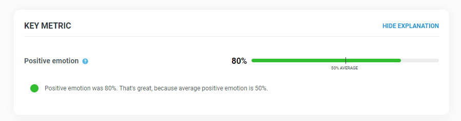
Example 1: Let’s have a look at the metric of “positive emotion” in Amazon’s “Holiday deals” campaign. 80 % people react with positive emotion to the ad. Green color of the barchart tells you that this score is well above average - that it is among the top third of all tested campaigns in this metric. Additionally, we can see what the average of positive emotion among all tested campaigns is: 50 %.
Result is yellow, if the score is around average of all tested campaigns. It belongs in the third of all campaigns, which are around the average score. In other words, the result is somewhere between 33rd and 67th percentile of all tested campaigns.
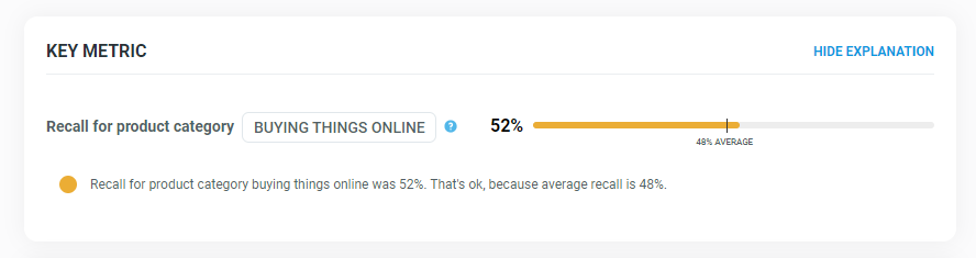
Example 2: When we look at the metric of “category recall” in Amazon’s “Holiday deals”, we see a yellow barchart. Apparently, 52 % people recognize the category in the ad, and that’s just an average score when we compare it to all tested campaigns. To be exact, the average is 48 %.
Result is red,if it is among the lowest scoring campaigns in this metric. It falls into the remaining third of all campaigns. Or mathematically speaking, it is among the 0th to 33rd percentile.
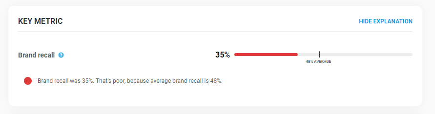
Example 3: 35 % of audience recognize the Amazon brand in “Holiday deals” commercial. The red-colored barchart tells us, that this score apparently falls into the lowest third of campaigns in brand recall.
What do the numbers in circles mean?
The circles focus on the KPIs of the report’s chapters. They tell you how well your ad scored in those key metrics compared to all tested campaigns.
For example, the circle for Branding doesn’t tell you the percentage of how many people recognized the brand. You’ll see that in detail in the report. The circle informs you about how much better your branding is vs. all other campaigns, based on your result in brand recall. The number is the KPI’s percentile. Basically, it tells you how many commercials you beat in that metric. After a quick look at the circles, you know how well your ad scored compared to other campaigns without being overwhelmed with detailed results.
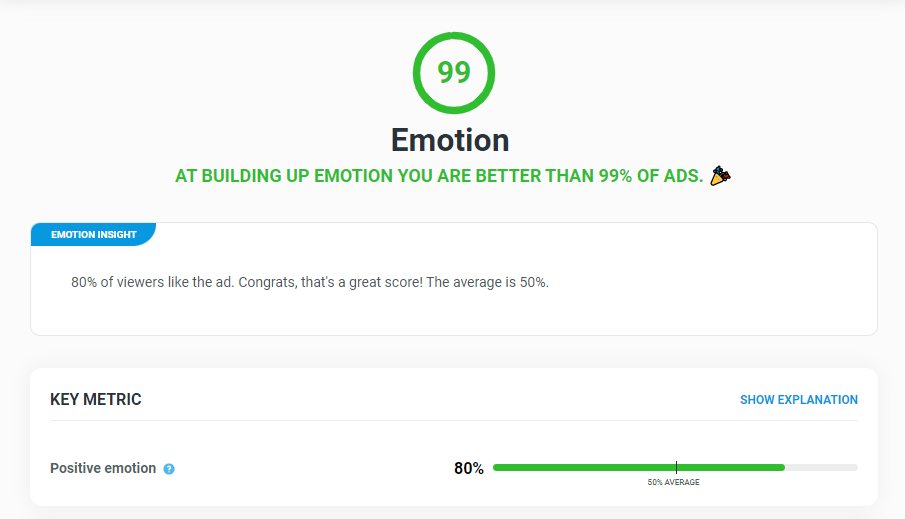
Example 1: Looking at Amazon’s “Holiday deals” again, we see that this ad nailed it in emotion - it’s better than 99 % of all ads! However, at branding, Amazon beat only 23 % of all ads. At Need and Ad impact, “Holiday deals” scored averagely. So, at this moment we don’t see the exact numbers hidden behind the success or bust (how many people reacted with positive emotion, recognized the brand etc.). But we see the crucial comparison of the ad to all tested campaigns.
At the beginning of each chapter, you see the circle and percentile again. Just below that in the Insight box and in Key metric, you can read the detailed result now. That is the KPI’s result in terms of how many people answered that way in the survey. When we compare that number to benchmarks (all tested campaigns), we get the metric’s percentile - how many campaigns this score beat.
Example 2: Regarding Amazon’s “Holiday deals” commercial, we see that at Emotion, the campaign is better than 99 % of all ads. Moreover, we now get to know the key metric’s actual result - that 80 % of the audience reacted positively to the ad.
Where do the benchmarks come from?
In the text above, we repeatedly say “all tested campaigns”: That’s our database of benchmarks collected over the last two years, stacked with data from hundreds of creatives. That way we are comparing your score with an up to date creatives rather than a body of historical material. We test hundreds of ads a year to have robust enough data to benchmark your ad to.
Benchmarks are important but tricky
Industry standard is seldom the right benchmark.
For most metrics, your industry is irrelevant. You have to cut through current advertising noise including ads from other industries.
For some metrics, you have to benchmark against concrete competitors.
Not surprisingly, benchmarks are very popular and vendors in the market research category are trying to market themselves accordingly: "We have 200,000 benchmarks in 3,000 product categories!" Good for them, but here is what you should know about benchmarks.
Better less but relevant
Famously, in 1936, a Literary Digest magazine polled 2 million of its readers to predict Roosevelt was going to lose the election. Roosevelt won, by far. There was another poll, who – having 20 times smaller sample size – got the election results right. It was made by George Gallup (unknown at the time, the biggest brand in market research today) and marked a new era in statistics. A sample of 1 000 people who correctly represent the target population by income and other socio-demographics, is enough. You just don’t need more. And it’s far far better than a 50-thousand or 1-million sample whose structure slightly differs from the population. Similarly, it’s much better to have several hundreds of good benchmarks than hundreds of thousands bad ones – representing irrelevant ads or out-dated metrics.
Now – what are the good benchmarks? What should the ads you are comparing yourself to represent? In most cases, the answer is: current advertising noise.
To cut through, benchmark against current advertising noise!
It’s tempting to compare yourself to your own industry, your direct competitors. You’re supposed to beat these guys after all. But here is the problem: the brains of the people scrolling through their smartphones or watching TV don’t care about industries. And your primary goal is to get their attention – to cut through the advertising noise whether it’s for cars, dating app or panda food. Imagine you are in an industry which really sucks in advertising. You can easily be the best in many metrics and still get zero attention. Automotive advertising, for example, tends to be quite conservative. A car driving through somewhere, with a brand mentioned in a pack-shot. Lower effectiveness, lower return on ad spend. Always look outside your industry box, or some future Tesla of your industry will.
A good benchmark is therefore a random sample of all ads that have recently been on-air. It's better to have a hundred of them than thousands of commercials that are dominated by some industry or are ten years old.
Ironically, marketing thousands of benchmarks could be a dangerous lock-in for traditional vendors. To avoid losing their thousands-benchmark assets, they are forced to keep many out-dated metrics.
Building brand memory structures: when your only option is being the best
So far, we were talking about getting attention. But getting attention is only a first step in advertising. The main principle of mind-winning advertising is creating the fastest neural path between a particular customer need and a particular brand. For example: I want to buy something online → Amazon.
And that’s where benchmarks are getting really tricky. Because only the winner counts. The human brain simply chooses the most mentally available brand. It’s irrelevant whether you are third or fourth best. The only relevant metric is: for how many people is my brand the fastest one. Industry average is again not much useful here. This time, you wanna be much more specific and know what particular brands are the winners for different groups of people or for different needs at your market.
So, let’s sum it up: either you have to cut through current advertising noise including ads from other industries, or you want to have data about your concrete competitors. In both cases, industry average is not what you need.